Le Mac Du Vin - Brand Identity Design
Project Scope
About
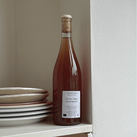
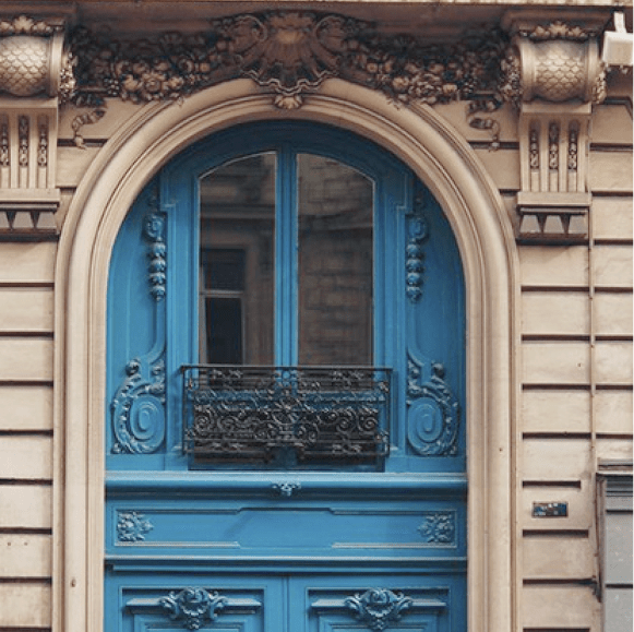
Le Mac Du Vin is a French wine distributor known for its curated selection and its distinctly Parisian sensibility. Their world blends heritage, craft and modern refinement, drawing inspiration from the cultural codes of French wine traditions and the architectural influence of early twentieth-century Paris. The brand already had an identity system in place, but it lacked cohesion and the visual sophistication needed for its next phase of growth.
The goal of this project was to refresh the brand identity with a more mature, contemporary visual language, something confidently French, quietly expressive and aligned with the brand’s character. Much of the focus centred on building a stronger logomark and tightening the surrounding system.

Initial Concepts
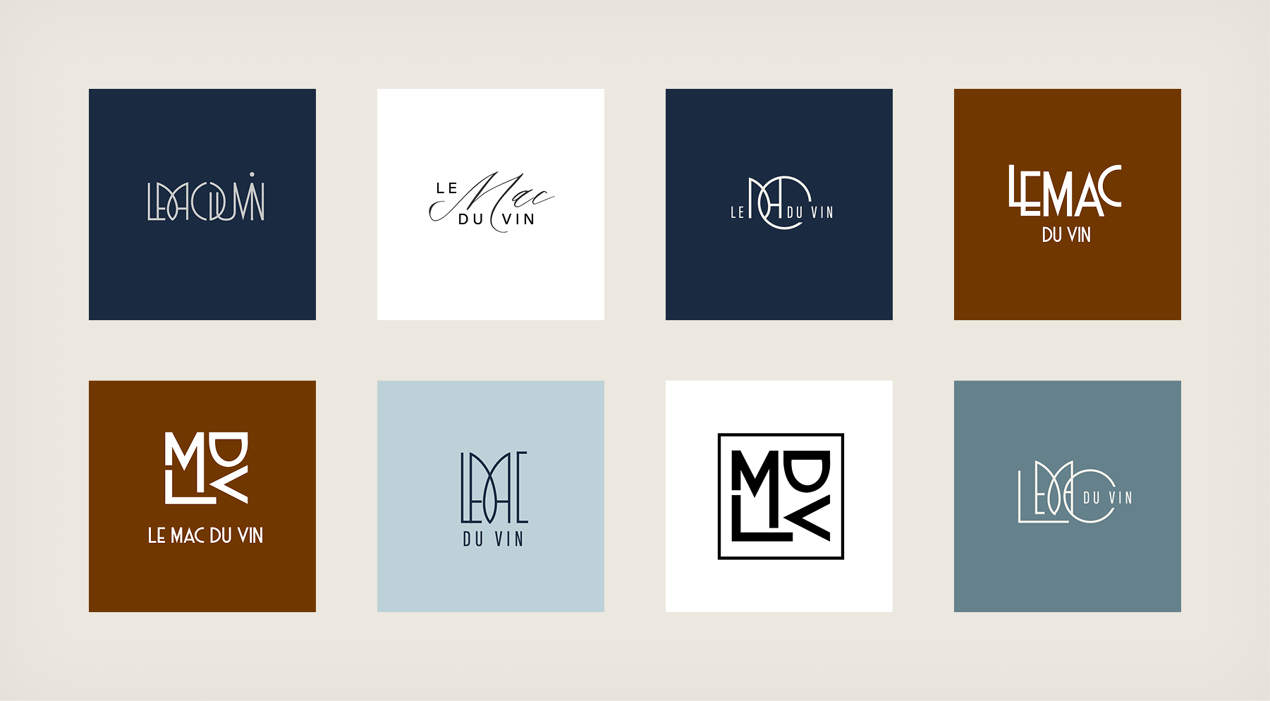
The exploration began by reimagining how the letters L, M, D, V could be assembled into a unified symbol. Numerous directions were tested, from elegant scripts to more experimental typographic constructions. Some options leaned into Deco-inspired forms, while others explored circular and modular compositions.
Early concepts often appeared promising but didn’t embody the strength or personality the brand required. Each round brought the identity closer to something more structured, intentional and unique to Le Mac Du Vin.
Logotype
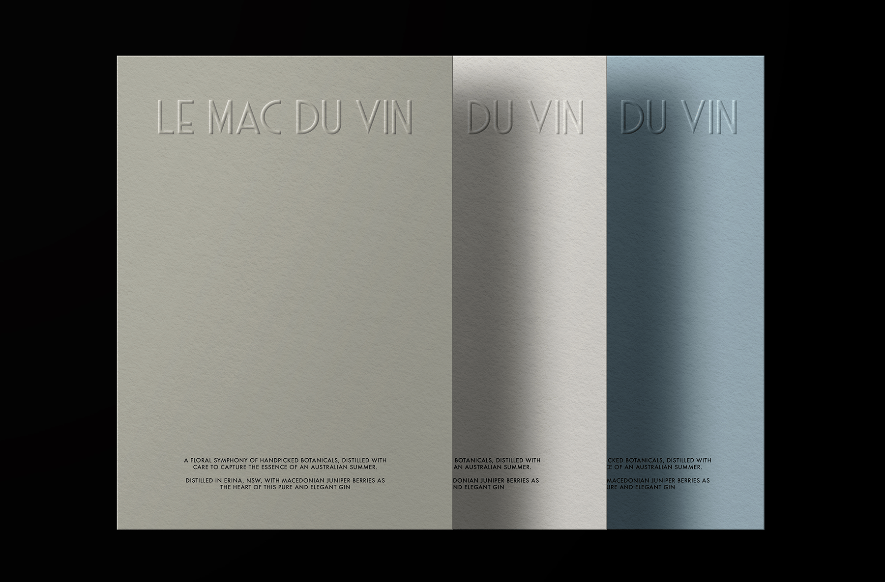
The logotype was refined to feel more architectural and modern, while retaining a sense of familiarity rooted in French typographic tradition. It uses a clean, confident structure that pairs well with the new monogram. The proportions and spacing were recalibrated to work seamlessly in both large and small applications, supported by a typographic system that balances expressive display type with more neutral, functional fonts.

ICON
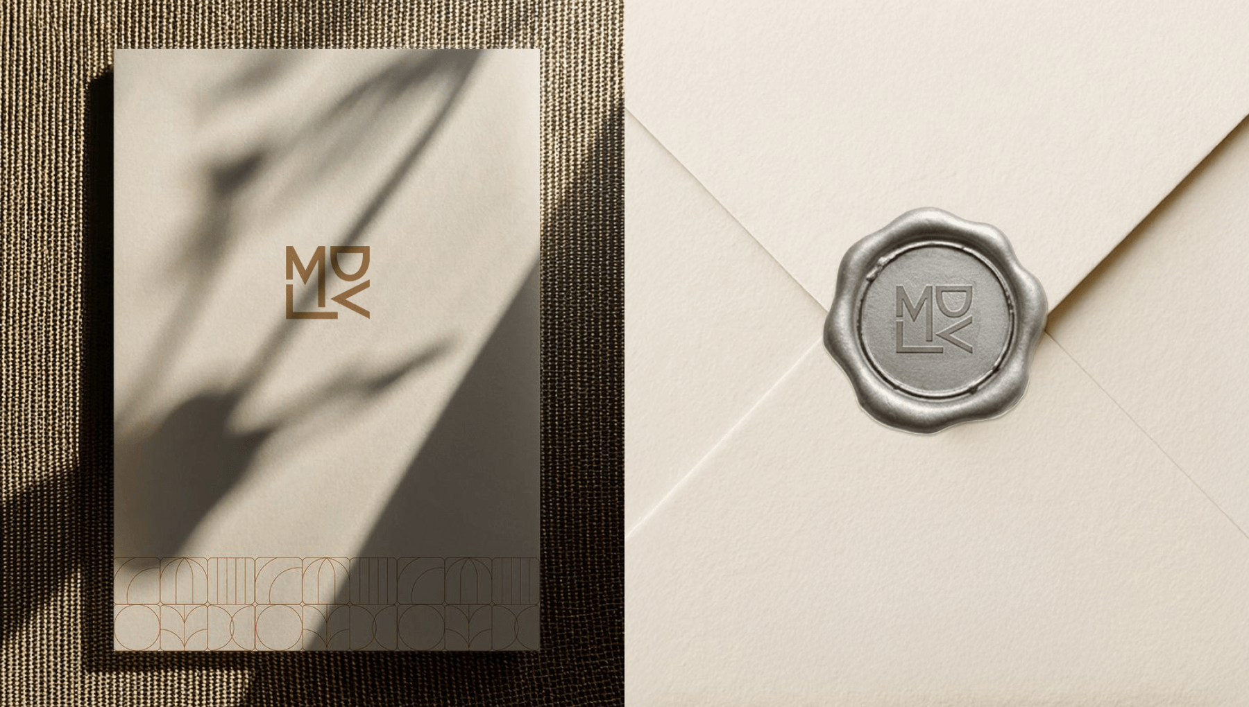
A major focus of the refresh was the creation of a new logomark — a bold, interlocking monogram built from the letters L, M, D, and V. The final symbol captures the geometric elegance of Art Deco while feeling distinctly modern. Its construction gives it a sculptural quality, making it work beautifully in foil, embossing and other premium production techniques.
The logomark is intentionally compact and recognisable, allowing it to stand alone on packaging, seals, digital assets and merchandise. Rather than depicting anything literal, the symbol acts as a refined stamp of identity. It communicates confidence, craft and French character in a minimal, timeless form.

COLOR & TYPOGRAPHY
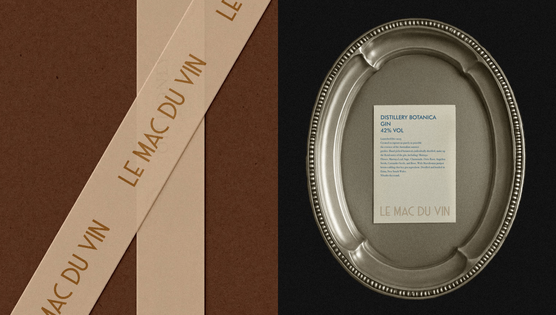
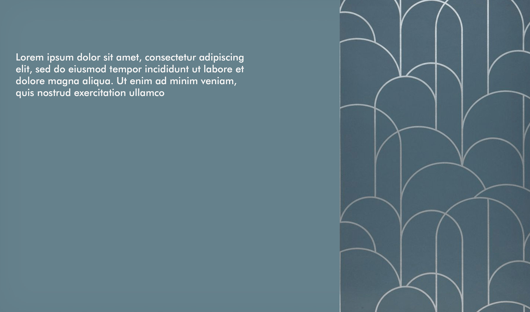
The refreshed palette draws from muted tones found in Parisian architecture and traditional wine environments: deep Estate Blues, soft Slate Blues, warm neutrals and a subtle golden accent. These colours create a calm, sophisticated atmosphere while offering strong contrast when paired with the logomark.
Typography builds on this mood with expressive display type for headlines and elegant serif pairings for extended text. The hierarchy is simple and adaptable, allowing the brand to remain consistent across labels, menus, collateral and digital platforms.

FINAL OUTCOME
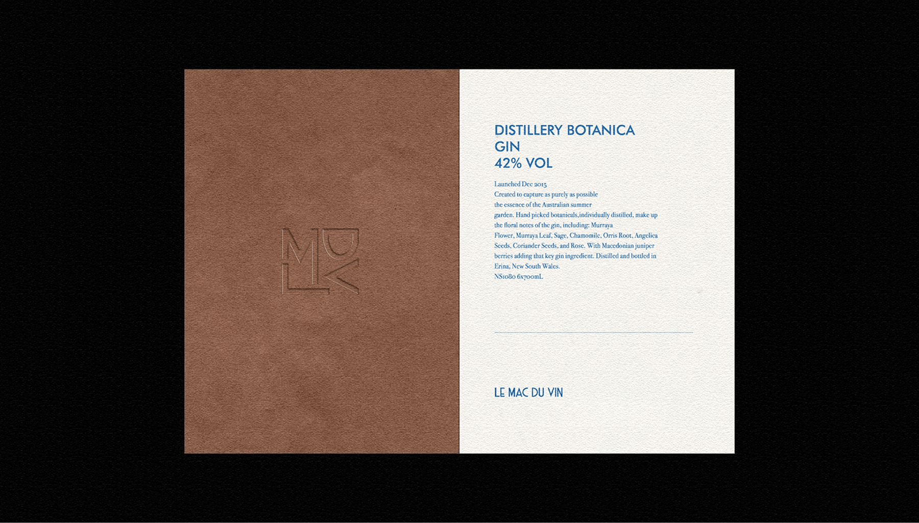
The brand refresh brings a refined coherence to Le Mac Du Vin. The new monogram has become the centrepiece of the identity, supported by a calmer palette, clearer typography and a more intentional design system. The result is a brand that feels mature, confident and unmistakably French – a visual identity that can grow with the company while remaining true to its roots.
This project was completed in collaboration with Laburnum Studios – a massive thank you to their team for the partnership.
Interested In Working Together Or Have A Question?