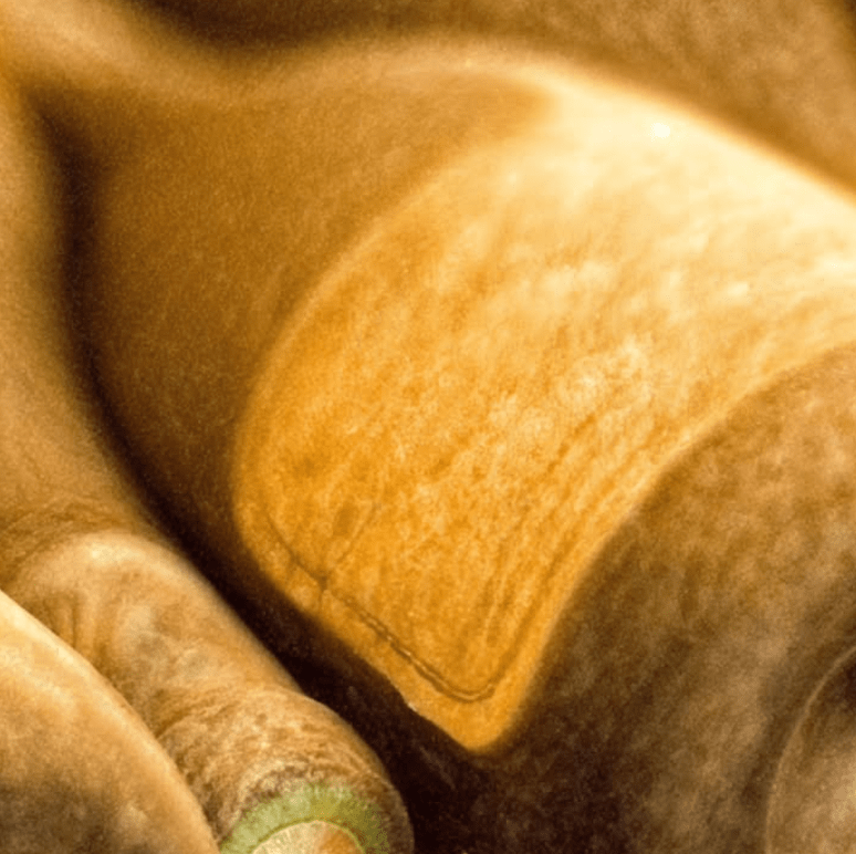
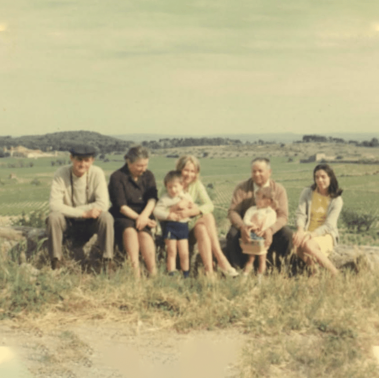
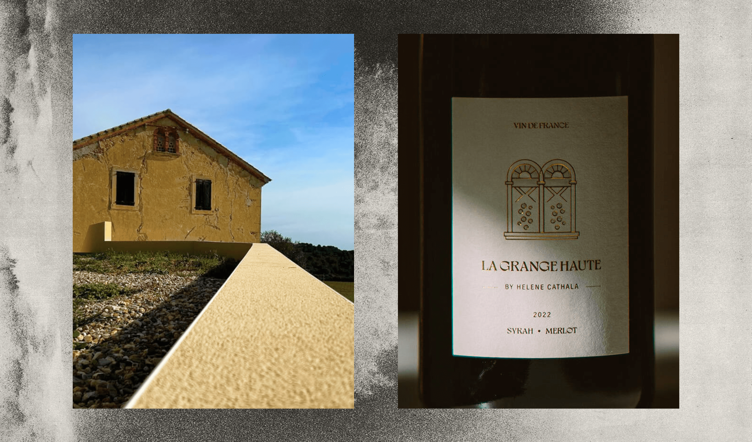
La Grange Haute is a small, heritage-driven winery in the south of France, grounded in traditional winemaking and a deep respect for its land. Their approach focuses on sustainable methods, small-batch production and an unwavering connection to origin.
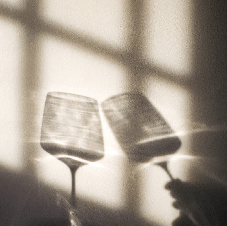
The project asked for labels that carried this same calm, intentional spirit. Nothing loud. Nothing decorative for the sake of it. The identity needed to feel honest, rooted and premium while still remaining minimal.
PROJECT GOALS
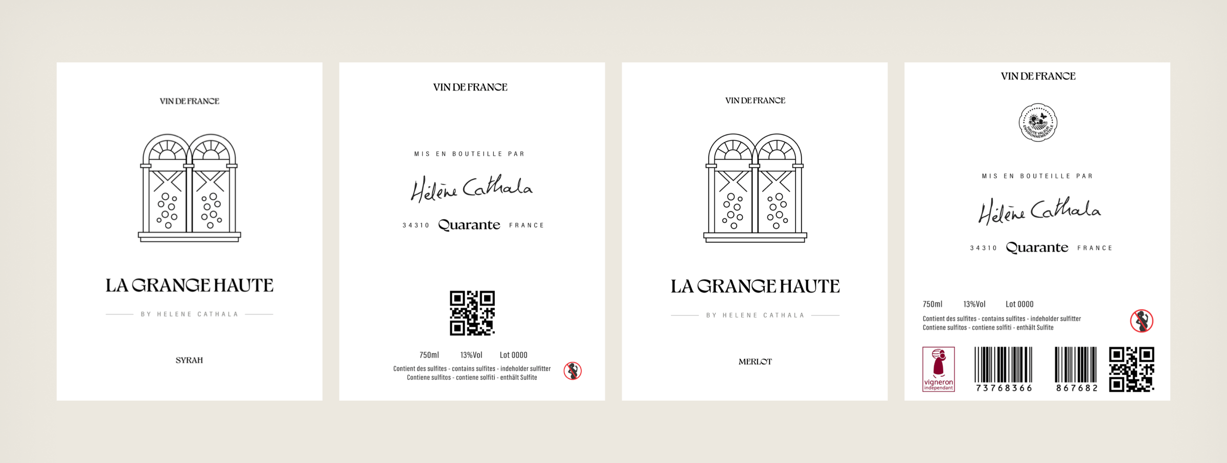
The goal was to create two labels that feel simple at first glance, yet thoughtful and grounded once observed closely. The winery’s heritage and craftsmanship had to come through in a refined, understated way.
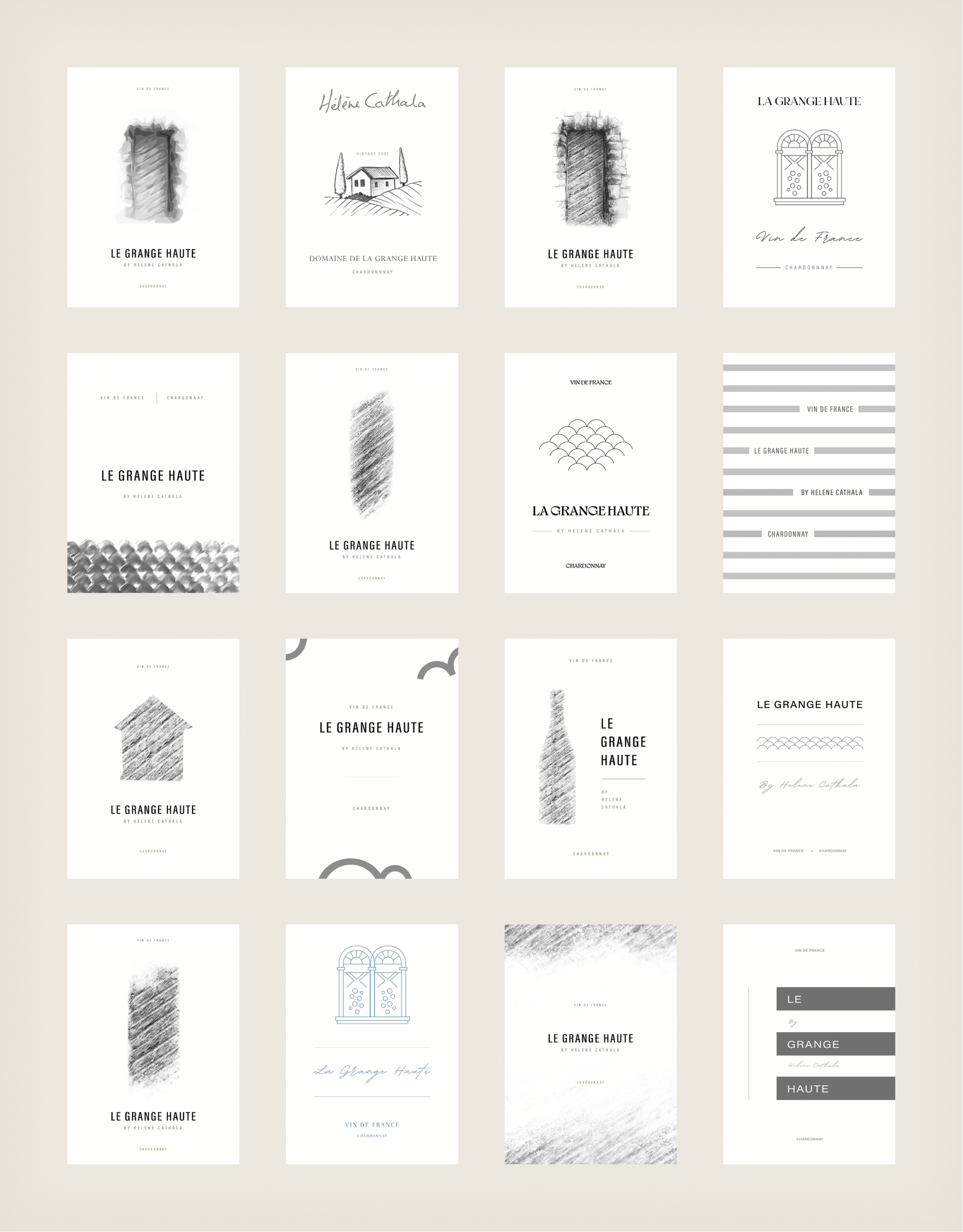
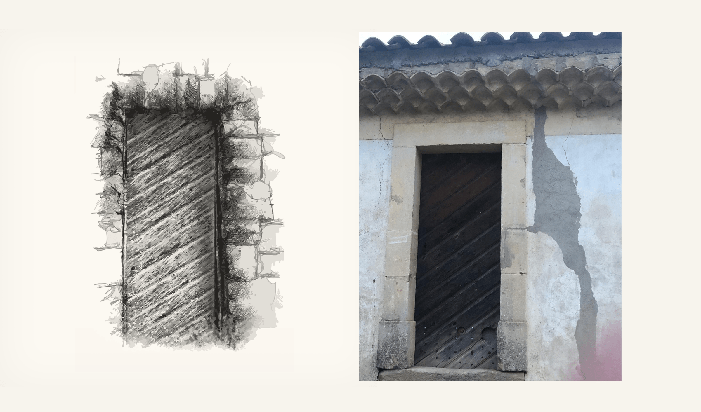
The early phase involved sketching, studying architectural details from the estate and experimenting with several illustration styles. Some concepts were richer and more expressive, but they didn’t feel aligned with the quiet nature of the brand. After many iterations, the direction became clearer: the identity needed to stay minimal, with illustrations acting as gentle references rather than literal explanations.
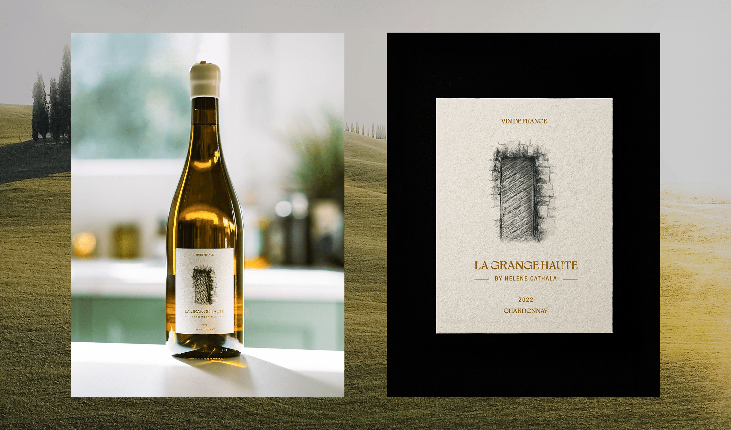
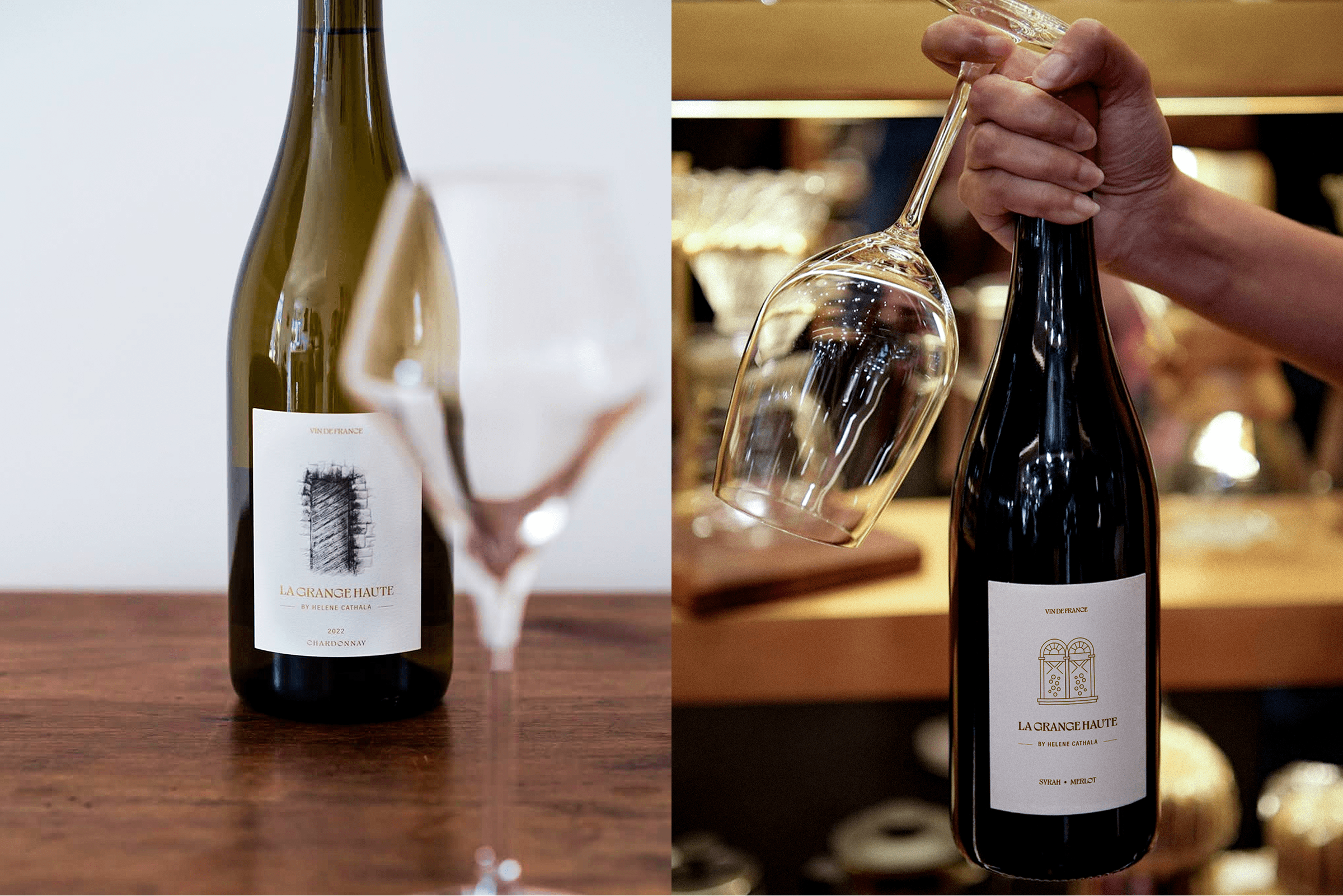
The Identity of Chardonnay
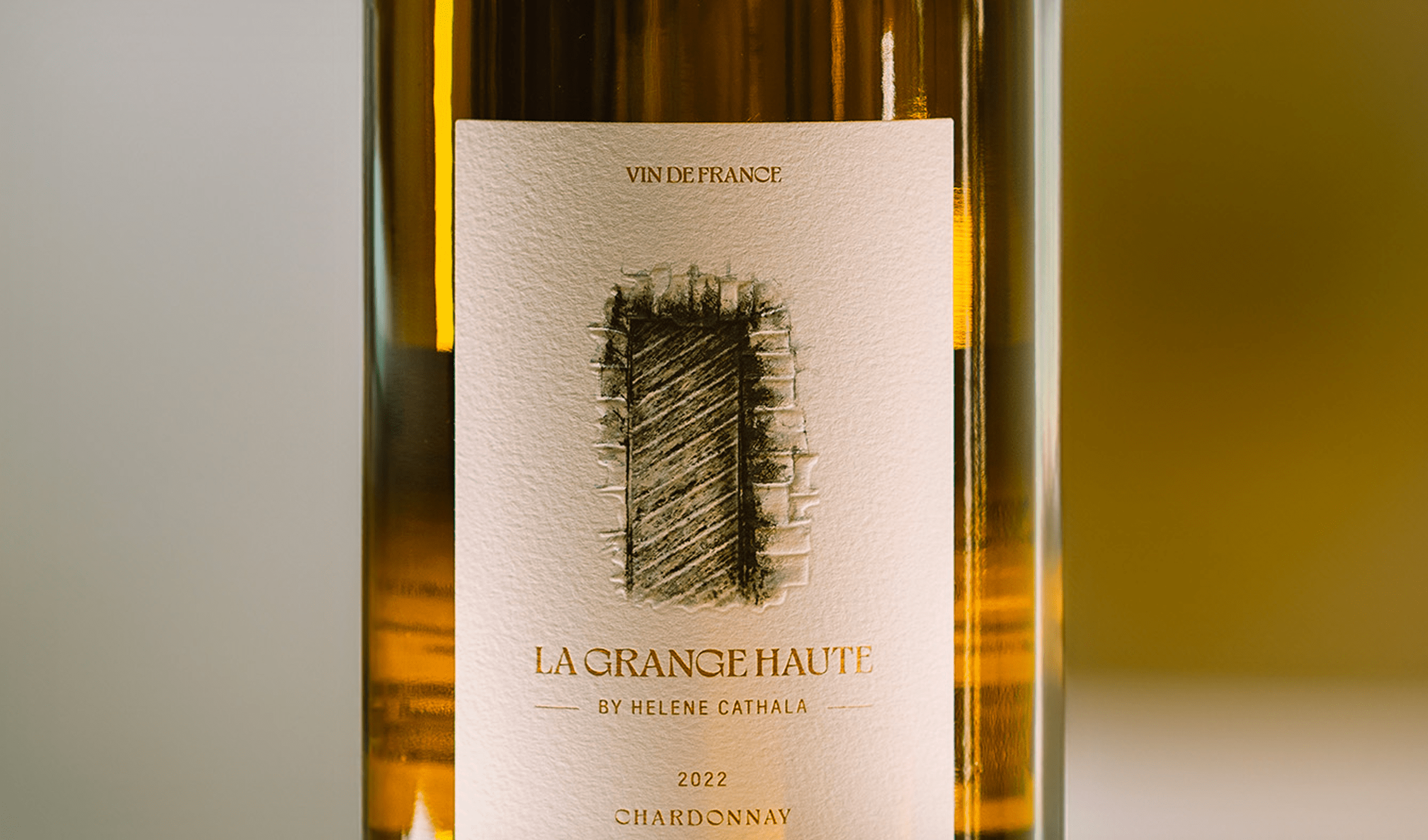
The Chardonnay label began with the idea of capturing a small but meaningful visual detail from the winery. An old wooden door on the estate became the basis for the illustration. It wasn’t chosen to tell a literal story, but to create an intimate connection to place. The hand-drawn texture brought warmth to the label, allowing the bottle to retain a feeling of heritage without becoming ornate.
Exploring Subtle Heritage
The layout was kept spacious and calm, giving the illustration room to breathe. A restrained typographic approach ensured that nothing competed with the simplicity of the mark. The result became a quiet nod to the winery’s history, expressed through minimal lines and balanced composition.
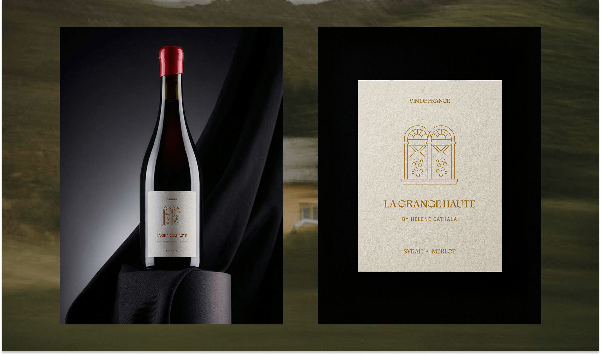
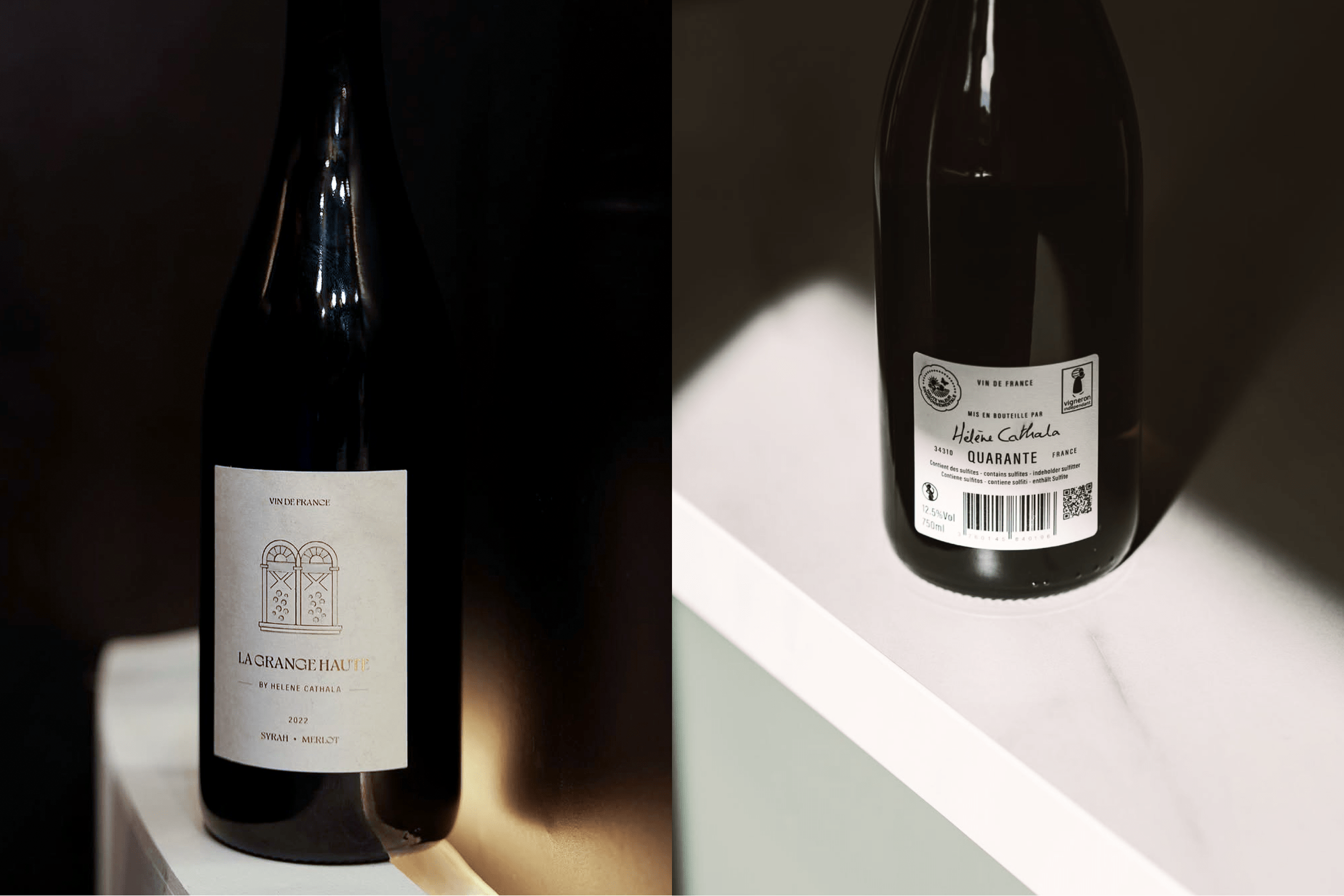
The Identity of Syrah–Merlot
For the red wine label, the direction followed a similar philosophy but with a new visual anchor. Instead of the door, a small architectural window from the property inspired the illustration. The shape carried a more structured tone, fitting naturally with the deeper personality of the Syrah–Merlot blend.
Expressing Depth Through Restraint
As with the white wine, several versions were created and refined before the final illustration settled into place. The layout remained minimal, supported by a grounded palette and a typographic hierarchy that added presence without weight. The final design reflects the richness of the wine yet stays aligned with the winery’s understated identity.
Final Outcome
Both labels work together as a cohesive system while giving each bottle its own character. The illustrations introduce a subtle narrative element, the layouts stay intentionally quiet and the overall tone remains premium and rooted. The final designs honour the heritage of La Grange Haute through simplicity that feels confident and timeless.
This project was completed in collaboration with Laburnum Studios – a massive thank you to their team for the partnership.
Interested In Working Together Or Have A Question?