Founded by Shriyyaa and Anubhavv, the brand collaborates with interior designers and architects to deliver styling solutions that blend bespoke art with refined aesthetics. With a deep connection to local artisans and an eye for detail, Eye Inspire transforms urban homes and hospitality spaces into soulful, elevated environments, curated, not just decorated.
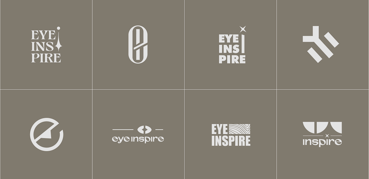
Initial Concepts
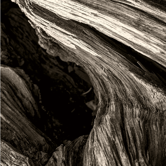
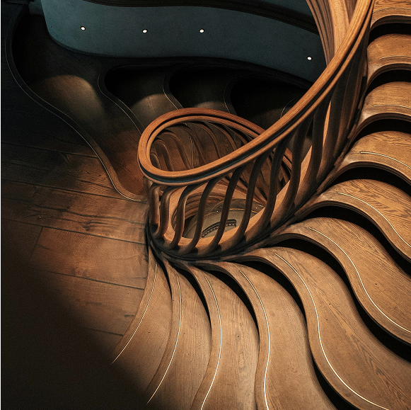
Our early explorations for Eye Inspire revolved around precision, minimalism, and quiet strength. We started by sketching forms that felt architectural yet organic, rooted in the brand’s thoughtful way of working.
The challenge was to convey calm without appearing cold, and refinement without excess. These initial directions tested various wordmarks, ligature treatments, and symbolic elements, all aiming to find that delicate balance between personal and professional. This stage was all about finding restraint that still carried presence.
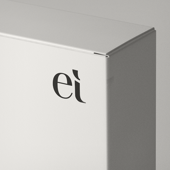
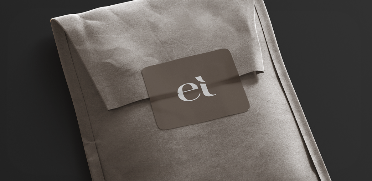
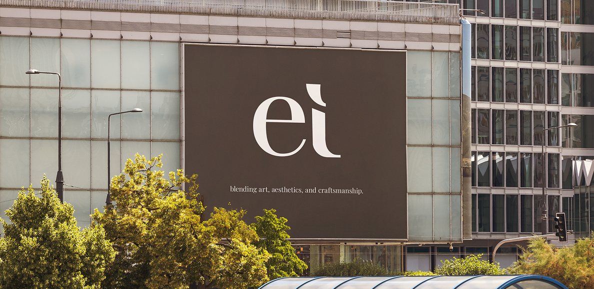
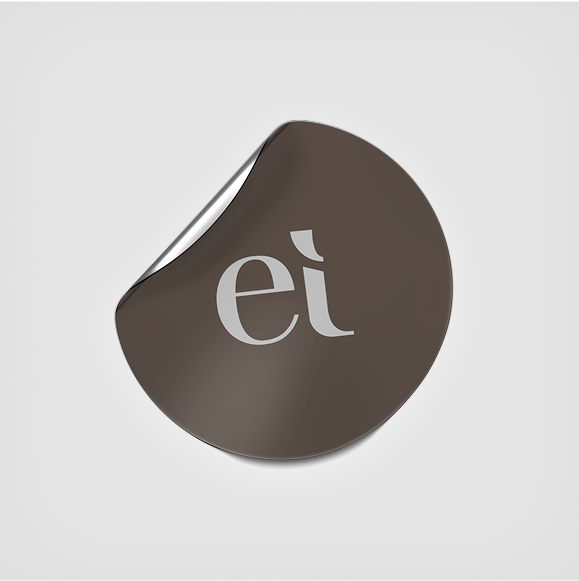
Icon
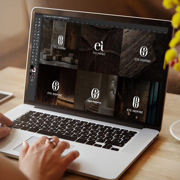
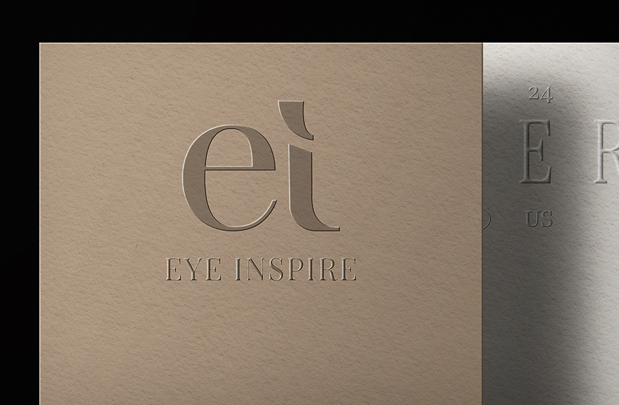
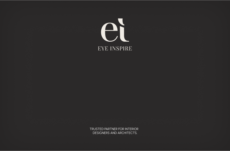
The icon merges the lowercase e and i into a refined ligature, an elegant shorthand for Eye Inspire. Its bold yet softened curves strike a balance between modernity and timelessness. The union of the two letters reflects the dual nature of the brand: expressive and intentional. It’s a subtle nod to individuality within structure.
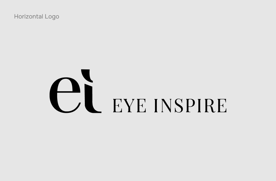
Logo Unit
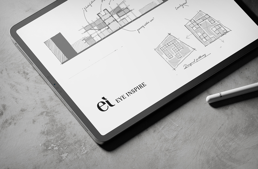
The two distinct units, vertical and horizontal allow seamless integration across various applications, from architectural presentations to social media and print collateral. Whether embossed on stationery or used digitally, each lock-up maintains brand clarity and sophistication. The consistent ligature and type treatment ensure that no matter the format, the identity feels composed, intentional, and unmistakably Eye Inspire.
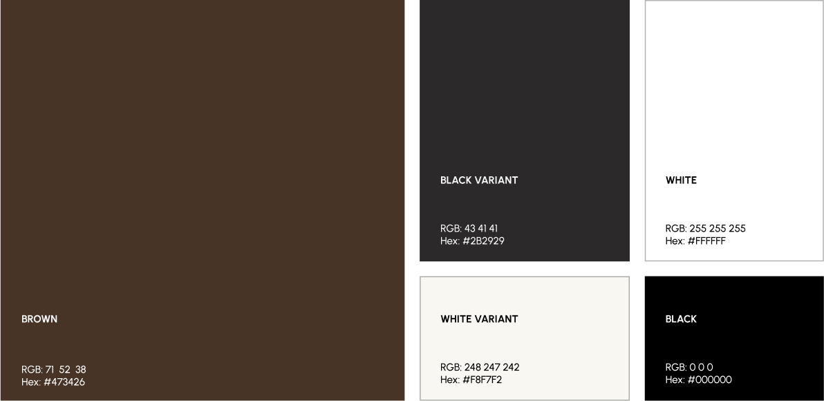
Type & Color
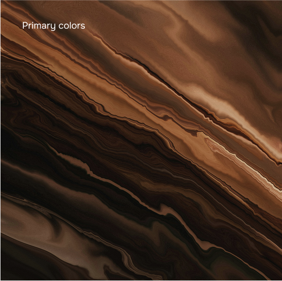
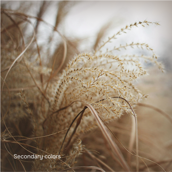
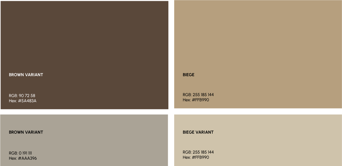
Eye Inspire’s palette reflects the brand’s architectural sensibility—subtle, composed, and enduring. A foundation of soft neutrals and stone-inspired tones ensures the identity feels timeless across touchpoints. These hues were carefully selected to pair well with architectural visuals, letting project imagery take focus while providing a refined backdrop.
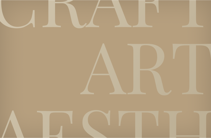
The typography balances elegance with structure. We selected a high-contrast serif typeface that carries a sense of refinement while maintaining clarity and strength, an ideal match for a brand rooted in architecture and interiors.
Interested In Working Together Or Have A Question?