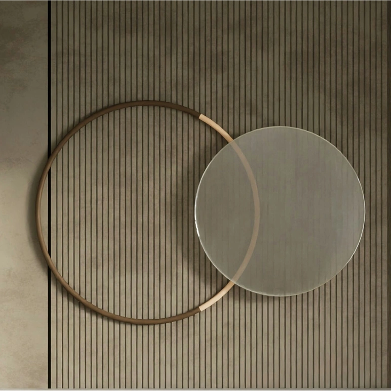
Studio Peace is an interior design studio and home decor brand born from a singular belief, that true luxury lies in tranquility. With a name that captures the essence of calm, the brand delivers end-to-end interior design services and a handpicked range of furniture and home decor products through its digital platform. Their approach blends Indian sensibilities with refined modern aesthetics, creating spaces that feel deeply personal, graceful, and grounded.
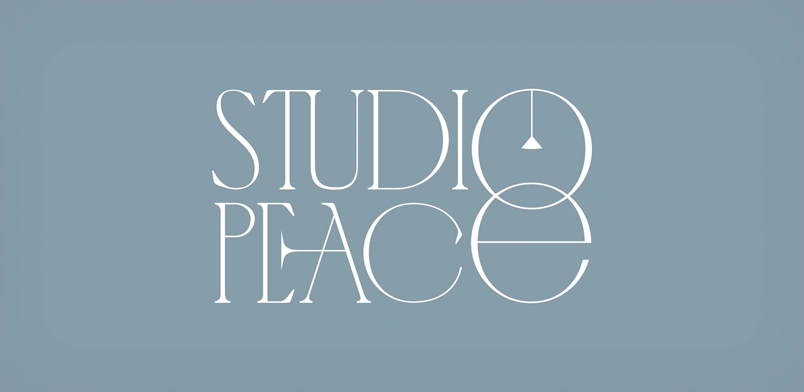
LOGOTYPE
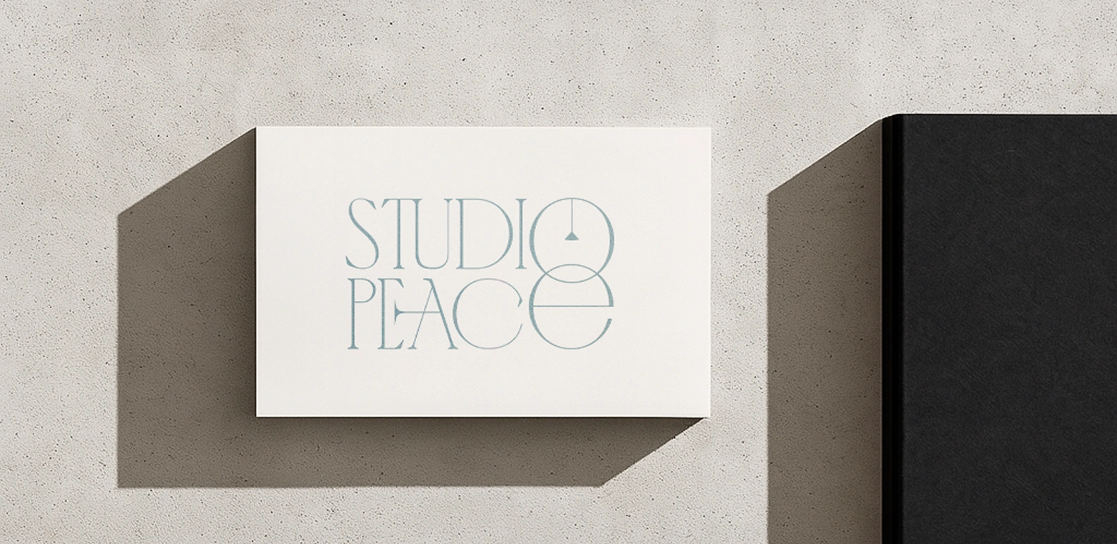
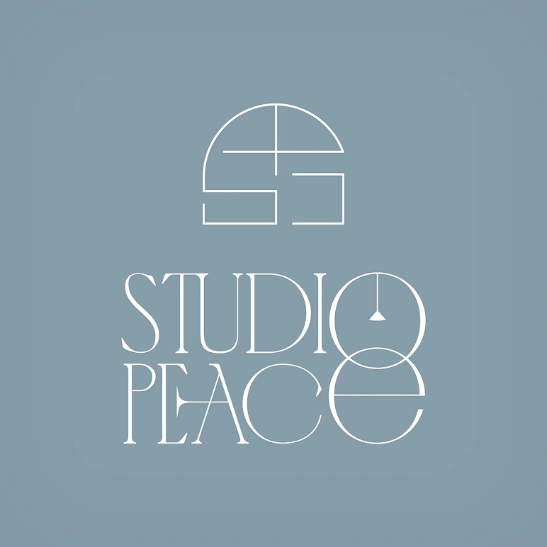
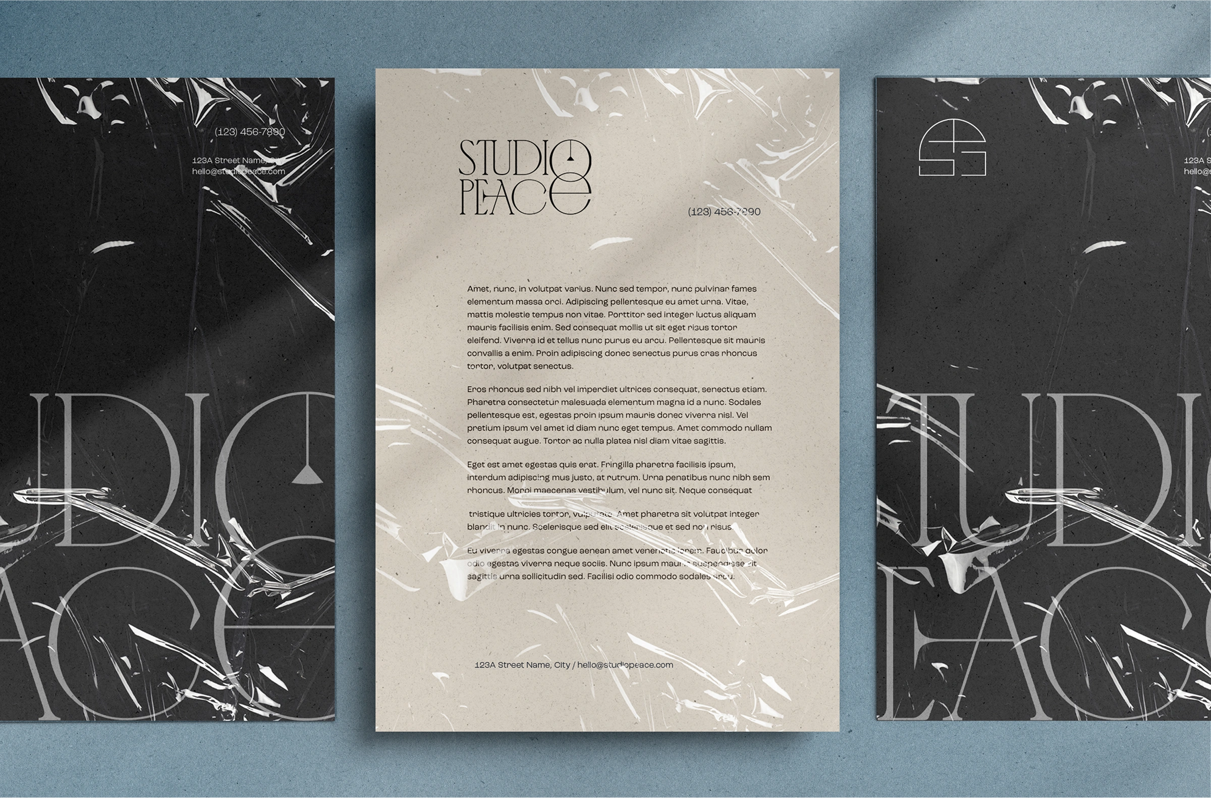
The logotype balances refined elegance with quiet character. Set in a custom serif, it carries a modern aesthetic while retaining warmth and charm. The standout feature is the hanging light within the ‘O’—a subtle yet thoughtful nod to interior design and home decor. It anchors the identity in its core offering, while the overall composition conveys calm, and custom feel.
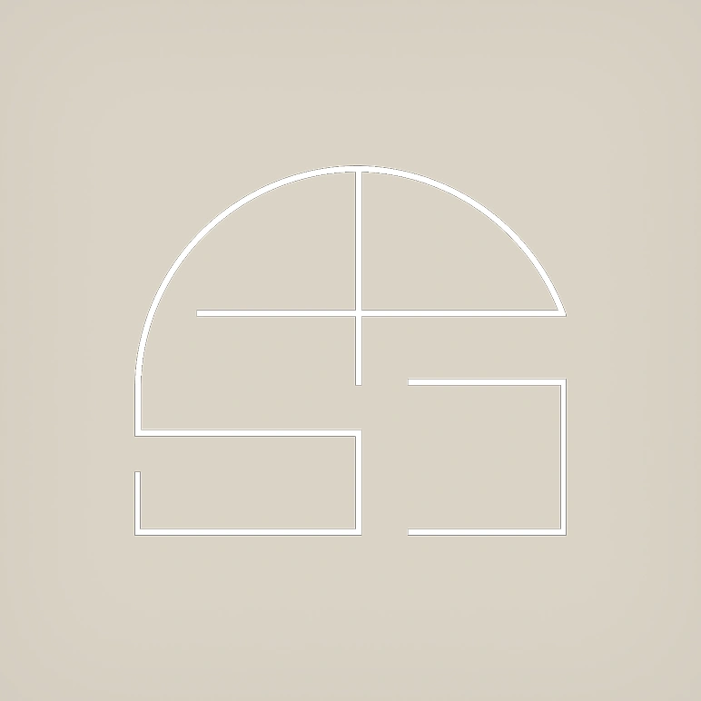
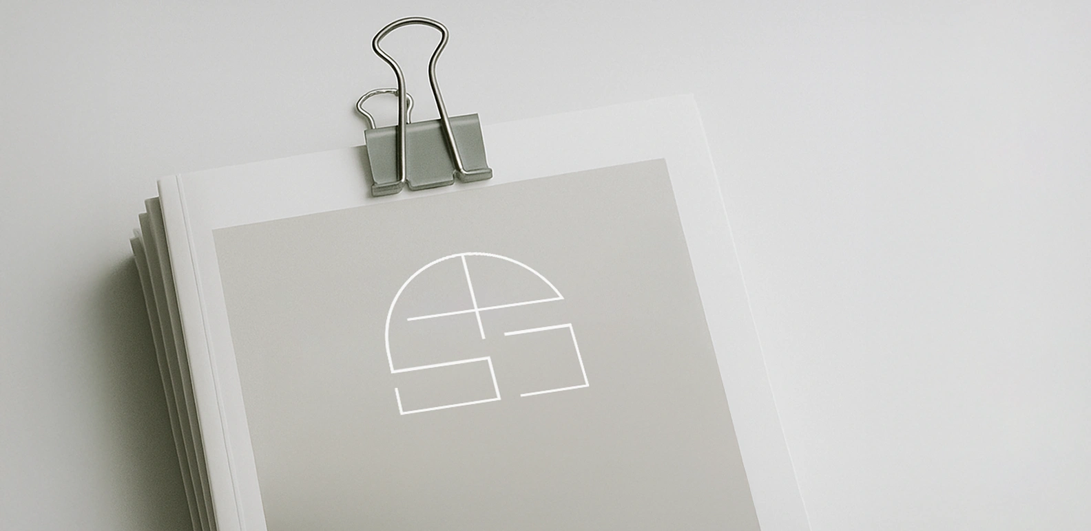
Icon
The Studio Peace icon is a geometric monogram derived from the initials “S” and “P,” seamlessly integrated within the form of a structured arch. The design reflects balance and architectural symmetry, symbolic of the brand’s dual role in interiors and curated decor. The use of spatial lines and negative space draws inspiration from floor plans and windows, grounding the identity in both form and function.
COLOR PALETTE
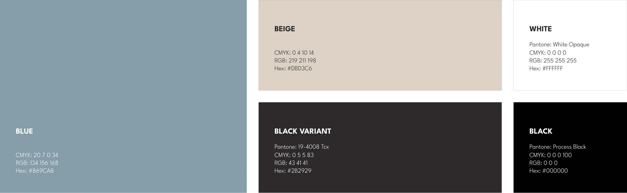
The muted blue evokes serenity and architectural openness—mirroring the stillness of dusk-lit interiors. Beige and white introduce softness and tactile calm, reminiscent of natural materials and curated spaces. Contrasted by black variants, these tones bring structure and visual depth, balancing aesthetic minimalism with premium spatial character.
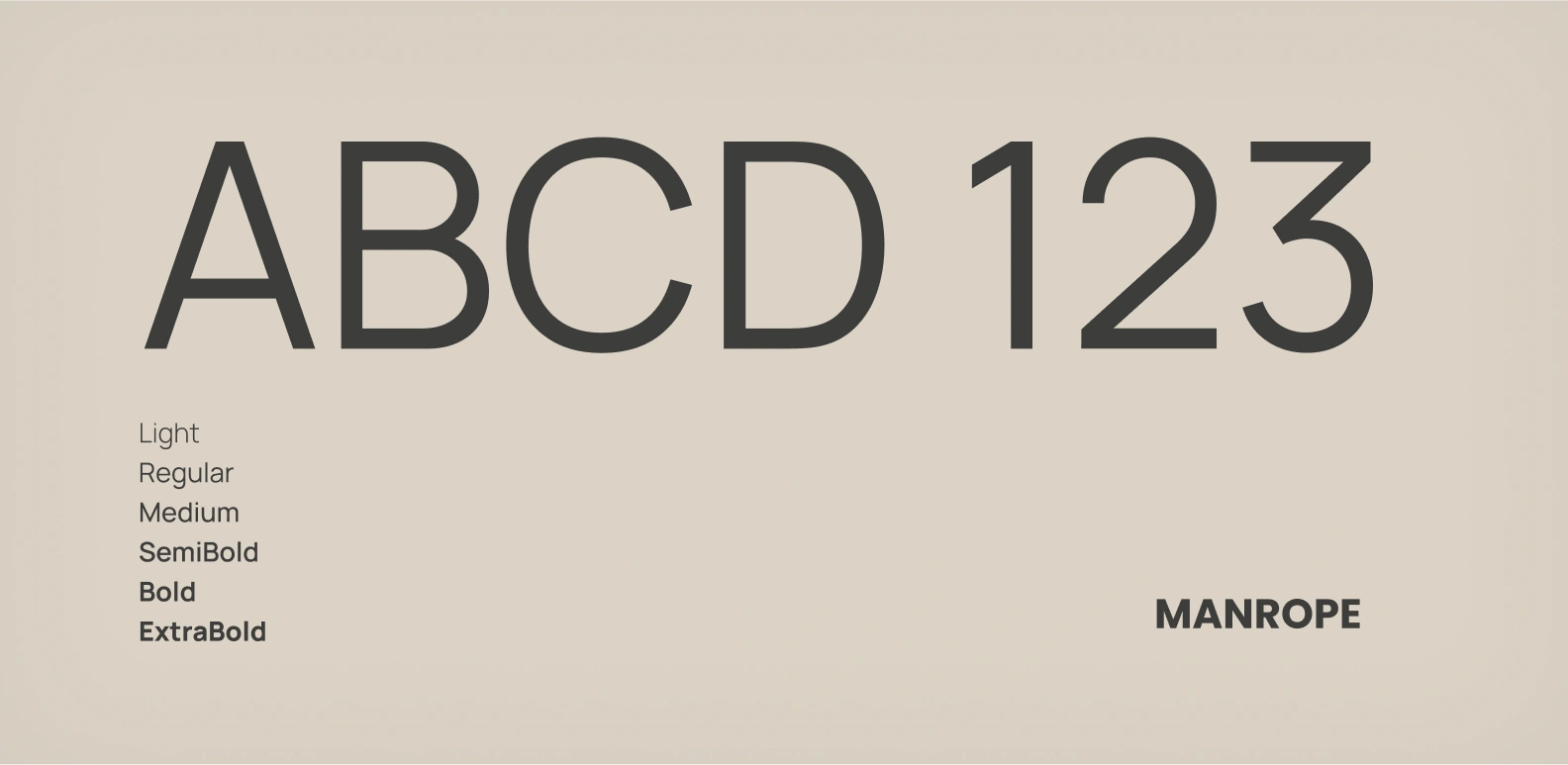
TYPOGRAPHY
For Studio Peace, the typography needed to reflect the brand’s core values of calm, clarity, and refined sophistication. We chose a pairing that balances softness with structure—bringing together the timeless elegance of EB Garamond with the modern simplicity of Manrope.
EB Garamond adds a graceful, classic touch that connects with the brand’s luxurious and mature side, while Manrope offers a clean, contemporary contrast that keeps the identity grounded and approachable.
Interested In Working Together Or Have A Question?